
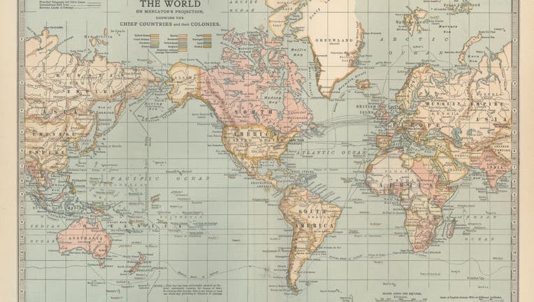
An early 20th century world map using the Mercator projection, which critics say exaggerates the size of regions near the poles like Greenland while shrinking Africa and South America. (Photo By Encyclopaedia Britannica/UIG Via Getty Images)
On most world maps, Greenland and Africa look about the same size. In reality, Africa is so large that at least 14 Greenlands could fit inside it.
That distortion, common on the widely used Mercator projection, is driving a campaign led by African advocacy groups and now backed by the African Union. Supporters say the way Africa is shown on maps affects how the world sees the continent of more than 1.4 billion people.
Africa appears too small on most modern maps
The backstory:
The Mercator map was created in the 16th century by Flemish cartographer Gerardus Mercator. It was designed to help sailors maintain straight-line courses at sea, but it also distorted the scale of landmasses — inflating areas near the poles and shrinking regions closer to the equator.
That means continents such as Africa and South America appear far smaller than they really are, while Greenland and Europe look larger.
By contrast, the Equal Earth projection, introduced in 2018, follows the planet’s curvature and shows continents in their correct proportions. But the Mercator projection is still common in classrooms and digital platforms. Google Maps switched to a 3D globe view on desktop in 2018, though the mobile app still defaults to the Mercator projection.
Groups campaign to replace the global map
The other side:
Two African advocacy groups, Africa No Filter and Speak Up Africa, launched the “Change The Map” campaign in April. Their goal is to persuade schools first, then international organizations and media outlets, to adopt the Equal Earth projection.
Fara Ndiaye, co-founder and deputy executive director of Speak Up Africa, told the Associated Press the issue is about more than Africa alone.
“Correcting the map is not only an African issue. It is a matter of truth and accuracy that concerns the entire world,” Ndiaye said. “When whole generations, in Africa and elsewhere, learn from a distorted map, they develop a biased view of Africa’s role in the world.”
Ndiaye added that when non-Africans see a smaller version of the continent, it “minimizes its demographic, economic and strategic significance.”
The African Union, a 55-member diplomatic body, endorsed the campaign on Aug. 14. It is the largest organization to sign on so far, and advocates called the move a milestone in the effort to reshape how Africa is represented globally.
Geographers say the Mercator projection is outdated
What they’re saying:
Mark Monmonier, a geography professor at Syracuse University, told the AP that the Mercator projection no longer has practical use.
“It was a useful navigation tool in the 16th century, because it has straight lines, giving navigators a line of constant direction to sail along,” Monmonier said. “But outside of that very narrow navigation application, there is no point in using it.”
Monmonier said even newer map projections have limits, because landmasses are irregularly shaped. “When you put irregularly shaped areas on a flat paper, people are going to have a hard time accurately comparing the size of landmasses,” he said, adding that bar graphs are often a better way to compare continent sizes.
The Source: This report is based on information from the Associated Press. Additional material was provided by Syracuse University.